Intro to Bootstrap
Learning Goals
- Understand the basics of Bootstrap
- Understand how applying Bootstrap makes websites responsive
We will build on our foundational understanding of HTML and CSS.
Warm Up
If necessary, re-familiarize yourself with earlier lessons:
What is Bootstrap?
Bootstrap is a popular CSS Framework used to develop responsive and mobile-first websites, based on a grid design. Most everything is built in a container, with rows and columns nested inside.
Most importantly, it is FREE to use.
How to use Bootstrap
You can use Bootstrap in one of two ways:
- You could download and install Bootstrap on your machine. But don’t.
- You could also use a CDN (content delivery network) to include a cached version of Bootstrap in your HTML code. This is the option we will use.
Include this <link> tag in the <head> of your webpage:
<link href="https://cdn.jsdelivr.net/npm/bootstrap@5.3.0/dist/css/bootstrap.min.css" rel="stylesheet" integrity="sha384-9ndCyUaIbzAi2FUVXJi0CjmCapSmO7SnpJef0486qhLnuZ2cdeRhO02iuK6FUUVM" crossorigin="anonymous">
Include this <script> tag before the closing </body> tag of your webpage:
Note: if you are not using JavaScript, you can skip this step.
<script src="https://cdn.jsdelivr.net/npm/bootstrap@5.3.0/dist/js/bootstrap.bundle.min.js" integrity="sha384-geWF76RCwLtnZ8qwWowPQNguL3RmwHVBC9FhGdlKrxdiJJigb/j/68SIy3Te4Bkz" crossorigin="anonymous"></script>
Containers, Rows, & Columns (Oh My!)
Out the box, Bootstrap is based on a grid design.
- Everything is built in a container.
- Rows are nested in a container.
- Columns are nested in a row.
- There are a maximum of 12 columns.
This image represents one container with seven rows. Each row has different sized elements that span a different number of columns.
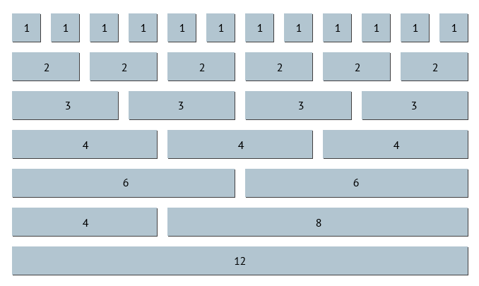
- The first row has 12 elements, each element spans 1 column.
- The second row has 6 elements, each element spans 2 columns.
- The third row has 4 elements, each element spans 3 columns.
- The fourth row has 3 elements, each element spans 4 columns.
- The fifth row has 2 elements, each element spans 6 columns.
- The sixth row also has 2 elements, but each element span a different number of columns (4 and 8, respectively).
- The last row has 1 element that spans all 12 columns.
Note: You can have exactly 12 columns, or less than 12 columns (the unused columns will appear as empty space). However, you cannot have more than 12 columns.
Responsiveness
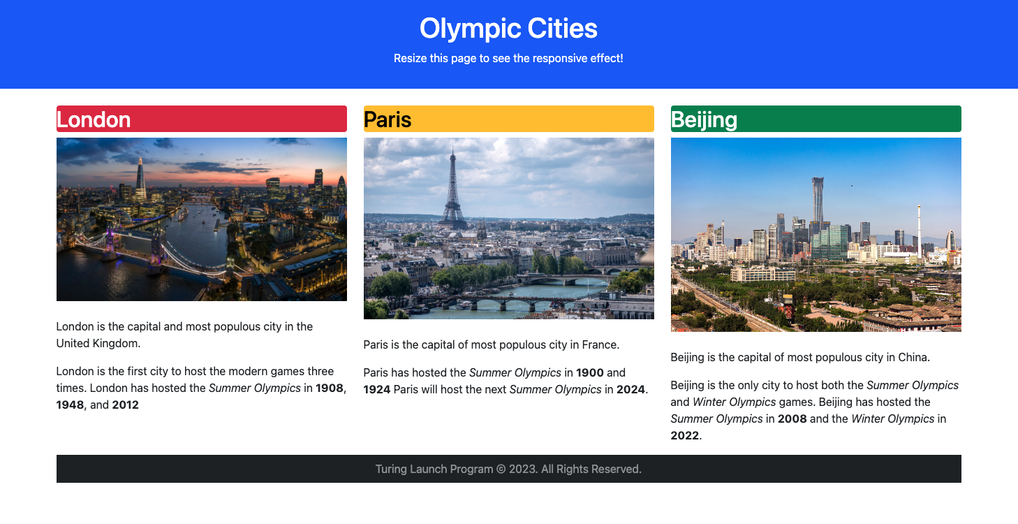
This is where the “responsive” part happens. Here is a screenshot of our example webpage as viewed on my desktop, in all its full-screen glory:
Here is the same webpage, viewed on my tablet in portrait mode:
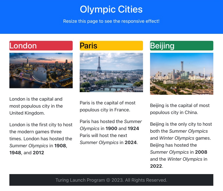
Some adjustments have been made for the smaller screen, but it remains unchanged for the most part.
Same webpage, this time on my phone:
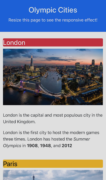
Whoa, big difference. But it would have been really difficult to read the text and view the images if they were all still side by side. I have to scroll to view the information for Paris (not to mention Beijing), but the experience is much better.
Classes
The beauty of Bootstrap is that you attach classes to HTML tags, and the magic just… happens.
Ok, it’s not “magic” (says Megan). The classes that we attach to the HTML tags correspond with pre-existing CSS styling rules in Bootstrap. In fact, if you opened the Bootstrap link added to the <head> tag of the example website, you will find a ginormous CSS file.
For example:
<h2 class="bg-danger text-white rounded p-2">London</h2>
There are four classes attached to this <h2> tag:
bg-dangerturns the background (bg) of this heading red (red means danger, right?)text-whitemakes the text white (this is the obvious one)roundedcurls up the corners of the heading (look closely)p-2adds some padding inside the heading (the bigger the number, the bigger the cushion)
And here is the result:

Let’s talk about the container a bit:
<div class="container">
  <div class="row">
    <div class="col-md-4">
      <h2 class="bg-danger text-white rounded p-2">London</h2>
        Picture and info about London...
    </div> <!-- End London column -->
    <div class="col-md-4">
      <h2 class="bg-warning text-black rounded p-2">Paris</h2>
        Picture and info about Paris...
    </div> <!-- End Paris column -->
    <div class="col-md-4">
      <h2 class="bg-success text-white rounded p-2">Beijing</h2>
        Picture and info about Beijing...
    </div> <!-- End Beijing column -->
  </div> <!-- End row -->
</div> <!-- End container -->
Let’s break this down:
- There is a outer
<div>for the container. - There is a nested
<div>inside the container for the row of cities. - Nested inside the row
<div>are three city<div>s.
Each city <div> – and the information within it – can differ using tags and classes. We use the same class for each column.
Breakpoints
The class for each city column is col-md-4.
colstands for columnmdstands for medium breakpoint4means it will span 4 columns. We have 3 cities,4*3=12.
A breakpoint is how wide the page needs to be to properly display its contents. In our example, each city <div> will remain 4 columns wide until the screen reaches the medium breakpoint, then the <div> becomes full screen.
| Category | Abbrev. | Range | Device |
|---|---|---|---|
| Extra Small | (none) | < 576 px | Smartphone (portrait) |
| Small | sm |
>= 576 | Smartphone (landscape) |
| Medium | md |
>= 768 | Tablet |
| Large | lg |
>= 992 | Laptop screen |
| Extra Large | xl |
>= 1200 | Desktop monitor |
| 2x Large | xxl |
>= 1400 | High resolution monitor |
This explains why the webpage displays columns on the desktop and tablet, but becomes a single column on the phone. In our example, we set our breakpoint to md so that it would appear “normal” on tablets and larger devices.
Want more Bootstrap?
Bootstrap has tons of examples to work through; scroll to Snippets to check out different headers, sidebars, buttons, etc. There’s an entire section for Navbars (navigation bars to your humanoid friends). If you view the dev tools, you can see the code for each example.
The Bootstrap documentation is pretty fantastic. By the way, version 5.x is WAY more extensive than previous iterations, almost overwhelmingly so. Digest in small bites.
If you prefer to learn tutorial style, W3Schools (naturally) has a great tutorial on Bootstrap 5. Prepare to be amazed on how complex (yet simple) Bootstrap can be to learn.