HTML and CSS Lab
FlexBox
CSS Flexbox is a powerful layout module that provides a flexible way to arrange and align elements within a container, enabling developers to create responsive and dynamic web designs. With Flexbox, elements can be organized in a row or column, adjusting their sizes and positions to fit the available space. Its intuitive set of properties, such as flex-direction, justify-content, and align-items, offer fine-grained control over the layout, making it ideal for building complex, yet adaptable, interfaces. Whether you need to create a responsive grid, a centered navigation bar, or a flexible card layout, CSS Flexbox provides a versatile and efficient solution for modern web development.
Spend 15 minutes exploring Flexbox with Flexbox Froggy
Recreating Comps
We are going to be practicing our HTML and CSS skills by re-creating images of web-pages.
Setup
- Fork this starter repl
- The content for the page is in
site_copy.md - All images are included in the
imagesdirectory
- The content for the page is in
- Choose one of the Comp Images to recreate from below.
- Update the
index.htmlandstylesheets/main.cssfiles to recreate one of the images below.- Use at least 5 html tags
- Use at least 2 classes
- Use at least 2 ids
- make sure to use semantic html tags!
Submission
- At the end of the lab, drop a link to your forked repl in the slack thread your instructor will start!
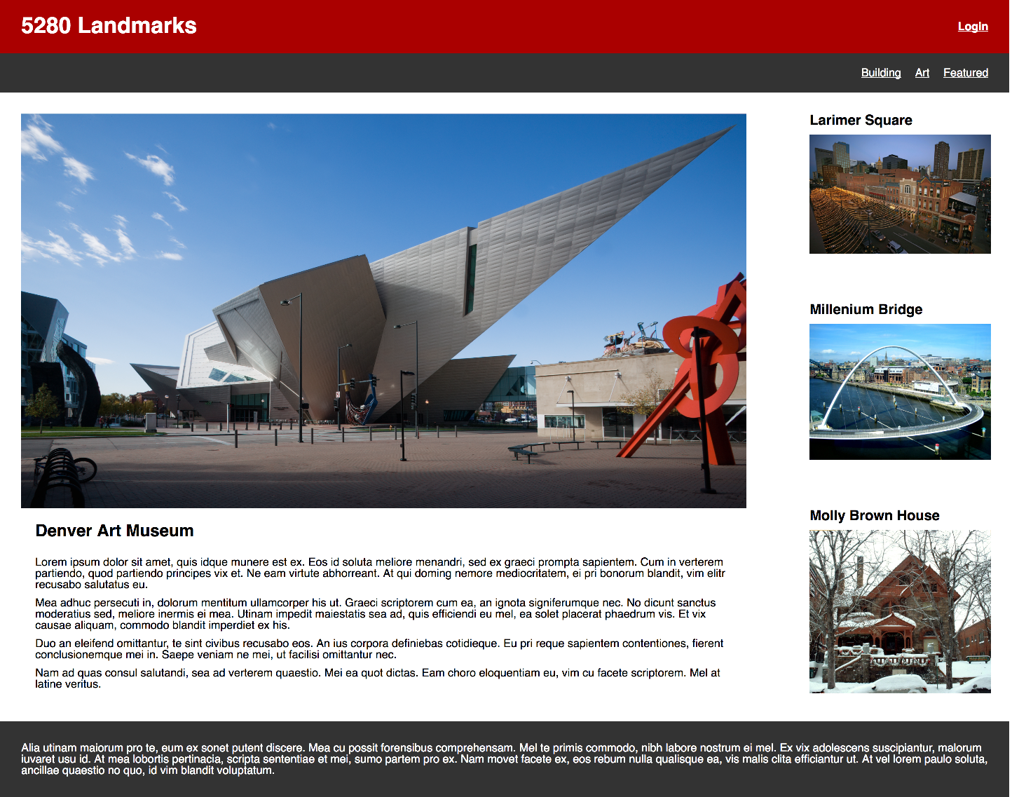
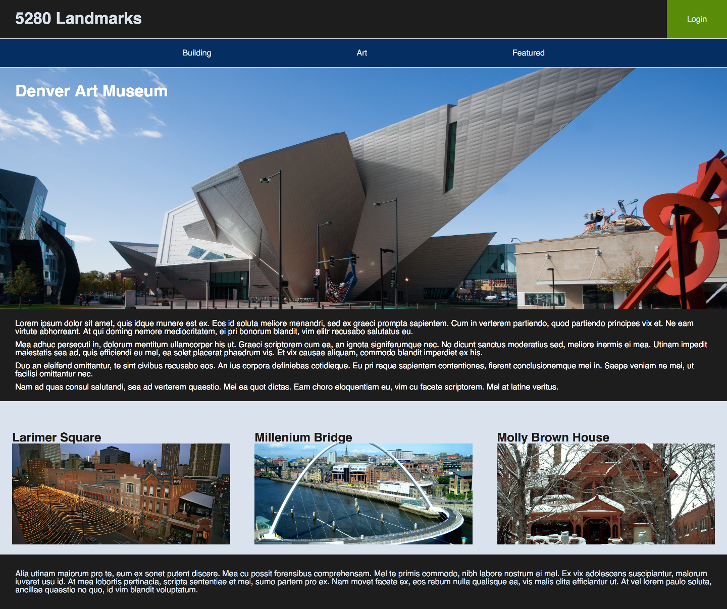
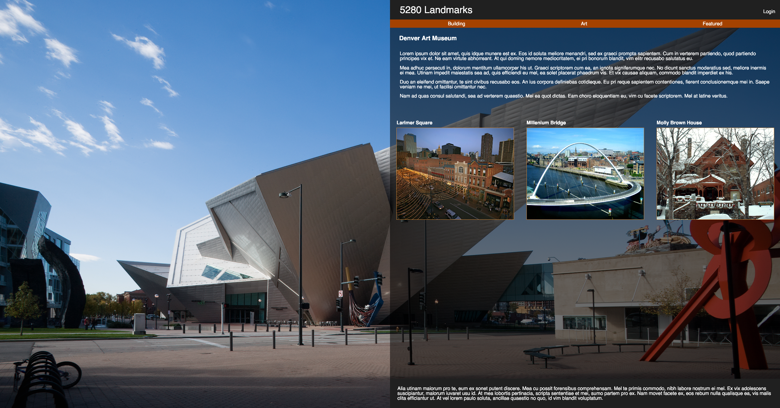
Comp Images
Option 1
Option 2
Option 3